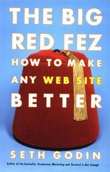
Про книгу The Big Red Fez: How To Make Any Web Site Better
Editorial Reviews
From Publishers Weekly
For those trying to make their Web sites profitable in the lean years, Internet marketing sage Seth Godin, author of Unleashing the Ideavirus, has written a practical guide to making sites more attractive to browsers. The Big Red Fez: How to Make Any Web Site Better offers simple but frequently overlooked design tips (avoid inefficient pull-down menus, dont ask for the same information twice) that will keep impatient users from ditching your site before they buy whatever it is youre selling. Godins primary mantra is to limit information on each page and offer clear incentives for clicking to the next screen. Each of his concise points is illustrated with an image from an actual Web site, making the book itself a model of simplicity that will be appreciated by busy entrepreneurs and Web designers.
Copyright 2001 Cahners Business Information, Inc.
From Booklist
While the average computer book is as thick as the unabridged telephone directory to China, Godins new Web marketing manual is so slender youll actually want to read it. Geared primarily toward those designing, building, or owning retail Web sites, the text encourages us to picture the would-be shopper as a monkey (wearing a red fez) whose attention will wander if he cant instantly find a "banana": a simple objective on each page that leads to a reward. (The author insists the comparison is not demeaning, saying were all monkeys once in a while.) Though he may be part of the insidious gang that seeks the best way to part us from our hard-earned cash, he is also a de facto consumer advocate; it turns out that what we find most annoying in the online world--Flash sites, crappy search engines, Spam--are the very things that cut into revenue. Imagine! After this brisk and humorous read, even a monkey would agree that this is how business ought to be done.
Keir Graff
Copyright © American Library Association. All rights reserved
